Five steps to create a persuasive slide deck
There’s a simple way to design a convincing and clear slide deck: follow a top-down process starting with a goal, creating your narrative, drafting your slides, adding the content, and then proceeding to the visual design. This method helped me get my point across as a product manager at Google.

8 pm. You’re creating a slide deck, and you feel stuck. You don’t know what to say next. You feel like you are not making the most convincing argument. The design of the slides is dull. Many slides are just a bunch of bullet points. Your efforts to make slides prettier are just making it worse. You already spend 2 hours moving things around, but something is still missing. You don’t expect people to like it, but you are marching through anyway.
How are some people making such polished and easy-to-understand decks? Is there a secret?
There is.
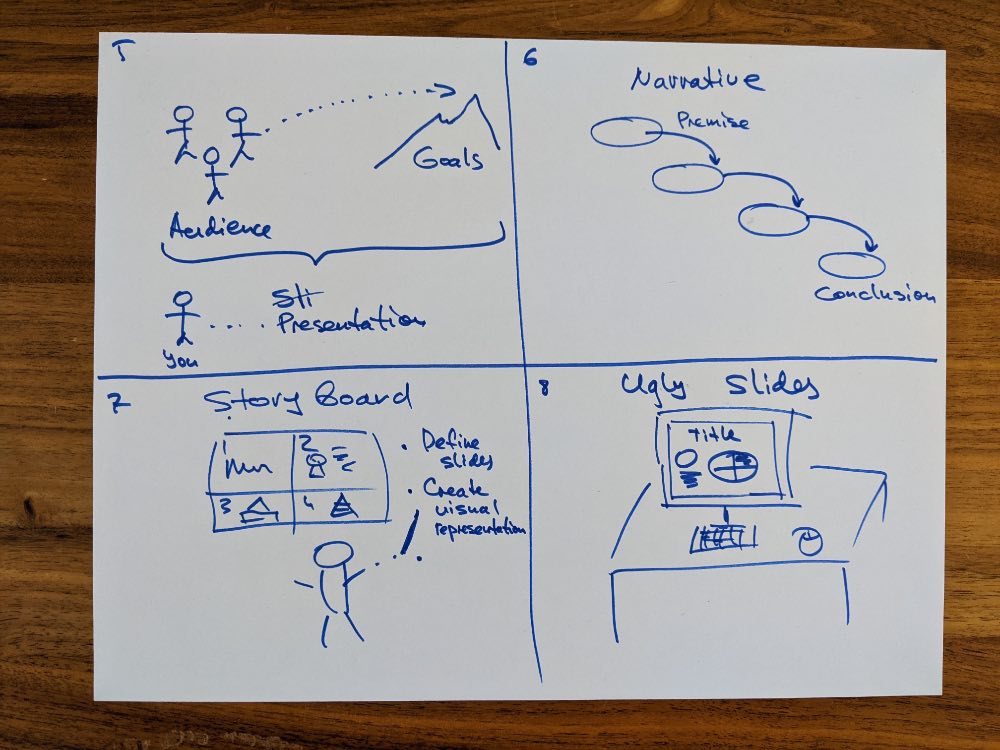
Presentations are like houses. You need to start with a foundation. Then you put walls and the roof, install electrical, water, and heating systems. Then you paint. You can’t start with a roof and paint it over before building the foundation and walls.
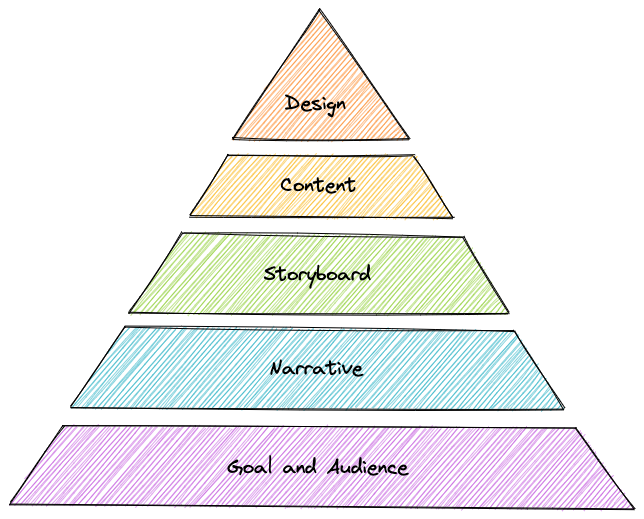
I’m proposing a process to design your slides in five steps:
- Goal & Audience: define who you are talking to and what do you want from them;
- Narrative: what story or argument you're presenting to reach your goal;
- Storyboard: drawing the first version of your slides on paper to unlock your creativity;
- Content: create slides with a simple design that get your point across;
- Visual design: create the pretty version once everything else is settled.
Step 1: Understand the audience and their goals
First, we must understand who we present to (the audience) and what we want them to do (the goal). This step is simple but essential. You may spend just a few minutes on it. However, if you get it wrong, nothing else will matter - you will be convincing the wrong people to do the wrong thing!
Audience. Are we presenting this to our peers, schoolchildren, or senior executives? The choice of language, argument, and level of detail would be different for different viewers.
Goals. What do we want the audience to do? Do you want them to approve your proposal? Invest money? Feel entertained? You need to know the goal to choose the right story, what type of jokes to include, and how to make the conclusion.
Aligning with your team. Sometimes you make a presentation on your own. However, the chances are that other people on your side are involved - your boss, your teammates, a friendly person on your client’s team. Therefore, it’s helpful to share your understanding of the audience and goals with them to ensure that they are on the same page with you.
Step 2: Creating a narrative
The narrative is the foundation of your presentation. It’s a story or a logical argument that you will tell to your audience. If you don’t know what you want to say, it’s tough to start with the detailed design and build your story afterward.
I’ve seen two types of narratives:
- Logical: Describes a logical argument based on a set of premises with a conclusion.
- Story: Describes a sequence of events that follows a path of a protagonist with a finale.
The critical part of both is a sequence of events, facts, and statements. After you developed the core argument, the rest of the content comes together with much less effort. It’s easier to see which content is relevant to your story and which is not. You can judge the quality of your arguments and keep only the soundest ones.
I like creating a narrative as a document. It can be short - just 1-2 pages. The requirements are:
- Completeness. The narrative needs to describe the whole story until its logical conclusion. The most significant benefit of having the narrative is that it ensures that you will not get stuck in the middle, not knowing where you are going from there.
- Connections. The narrative also includes logical connections between parts. It makes sure that the story builds up sequentially and makes sense to the listener. It keeps the arguments building on each other without making jumps that are hard to understand.
The benefit of having a document is that it’s straightforward to change. You can move text around. You can replace parts of the content in a matter of minutes. It’s free from visual distractions of the presentation software. Otherwise, it’s tempting to slip into the graphic design and get sidetracked from the task of improving your story or logical argument.
Once the narrative is done, it might be a good idea to share it with your teammates:
- Do they agree with your premise?
- Do they find the story compelling?
- Do you have good logical connections?
- Are you landing the fitting conclusion?
- Does your content have the right tone and scope?
It’s much easier to make changes while the story is still in the text mode before converting it to slides.
Step 3: Storyboard slides
An example of hand-drawn slides storyboard
After your narrative is done, it’s time to start working on the slides. Again, I recommend creating the first version with a marker and paper to unlock your creativity and avoid being trapped by slide templates.
Many presenters get into the trap of using pre-defined templates from their presentation software. Templates were created to streamline the design of the slides. However, they tend to narrow down our thinking and switch our brains into selection mode instead of creation mode. Using slide templates is similar to filling web forms. Did you ever get creative by filling forms?
On the other hand, drawing slides by hand unlocks your creativity and asks you to express your mental picture on a blank canvas. In my experience, when I start with pen and paper, my slides have more pictures, diagrams, and a good visual hierarchy. Hand-drawn slides on paper usually don’t follow any predefined structure. I’m free to lay out my ideas on paper and create rough illustrations of my narrative.
Your inner judge will stay silent when you draw slides on a paper because it’s clear that this is not a finished product but just a very early exploration that you don’t need to show to anyone.
You will have to decide on how to split your narrative into individual slides. The rule that works for me is to have a single main idea per slide. Then, you can include your main idea as a title and use the rest of the space to build the supporting argument.
Step 4: “Ugly” slides
After the storyboard is ready, it’s time to work on the content. The “ugly” slides include all the information but have a straightforward unpolished visual design. The goal of these slides is to tell the story with all the detail but still be easy to change.
It’s hard to get the content right the first time. You create the first version, review it, see which parts are working and which are not, and then make changes. Usually, I go through many iterations of each slide before the content is ready.
Nicely designed slides are difficult to change. They include the content and a lot of dependent design elements. A simple content change may require a complex redesign of the visual part. That’s why I don’t recommend starting graphic design until the content is very stable.
If you focus on the design too early in the process, you will tend to lock down graphic elements and not want to change them anymore because it’s so time-consuming. Here’s the risk: a polished design will create resistance to further improving your content. It may tempt you to keep the slides as they are to avoid changing the already beautiful layout.
The content needs to go through a critical review before you consider it’s fully ready:
- Do we have enough information to support the argument?
- Is the terminology correct?
- Are we approaching the discussion from the right point of view?
- Did we include too much data that distracts the audience from the main point?
- Do we show the most critical content prominently on the page?
“Ugly” slides are a great way to test your presentation end to end and check that the narrative, the slide transitions, and the content all work together. Usually, I would do a few test runs of my deck with a non-executive audience to get feedback and polish my message.
Step 5: Visual design
Finally, once you are confident in the narrative and the content, you are ready to start the visual design.
Visual design is an important topic that deserves a separate book or an educational course. However, since I’m not a design professional, I will include just a few survival tips that I use and point to other resources for further exploration.
The easiest way to create a great visual design is to ask a professional designer. I've been making slides for 20+ years. However, I’m still amazed at how quickly professional designers make my deck visually stunning. Also, I observe their work, ask questions, and use some of their tricks later by myself.
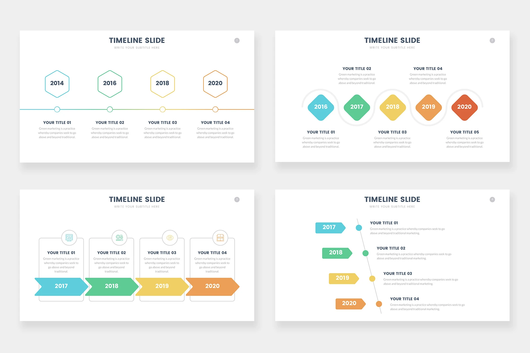
Pre-made slide templates can give you good ideas on how to organize the content. I purchased a set of templates from infograpia.com. While you can download the slides and insert them in your deck, in reality, it rarely works. The templates may have a different theme, size and generally, look out of place. So instead, I usually take the content organization ideas and re-implement them in my deck from scratch. For example, if you need a slide with a timeline, you can take these layouts from infographia as an inspiration and design something similar yourself.
There are a few good resources to improve your visual design skills further:
- Presentation Zen and Presentation Zen Design. A classic book with a lot of tips on visual design. This book started a new movement on designing very clean and visually striking slides. In my opinion, this approach works better for storytelling than for business presentations. In the business world, it’s common to send your presentation deck in advance. It also serves as a document that people review independently from your story.
- Slidedocs. The directly opposite approach to Presentation Zen. Nancy Duarte embraces the idea that slides are used as documents and provides many ideas and layouts to use effectively.
- The Non-Designers Design Book is my favorite book on visual design. It explains in simple terms the most important design concepts that you can see professional designers discussing: proximity, alignment, repetition, visual hierarchy, and typography.
Good luck creating your deck and please let me know how this approach works for you! Please reach out to me at [email protected] if you have any questions or suggestions.